Thursday, October 15, 2009

Idea for tiny spaces: Breakfast Settee

Photobucket

I came across this advertisement for Raoul Textiles, a company whose fabrics are full of color and pattern with a vintage feel to the cotton/ linen blend. I have used them before in a project and am always interested in their new products. However, besides the colors in this advertisement it is the placement of furniture that caught my attention.

Now that I am living in these tiny places in NY, I am forced to think outside the box, in terms of furniture placement. This idea of having a corner banquette/ bench placed against the wall with many pillows is a perfect transitional piece. When not using it for a dining table, it could easily be used as a sofa. Make sure you place your television in a spot that is visibly accessible from the table and magic- you have an upholsterd piece for two purposes. Not to mention, the table could be used as a desk, too.

Who says you can't have dinner parties, or tea parties, in a small studio!?!

Cheers!

The Designista


Metropolitan Home & Showtime House: Tribeca- I am there!


If you are like me at all, the days just seem to fly by. Right now I am so intent upon doing and seeing things in this amazing city- the design capital of the world, the city that never sleeps, the city that offers more free things to do than anywhere else (which I haven't utilized AT ALL, but will) - basically, a concrete playground full of culture and excitement.

So..... I have been talking about going to the Metropolitan Home's Showtime house in Tribeca since this summer, and have yet to go. Well, thank goodness I sat in the bed last night catching up on reading the mags and found that this weekend is the last weekend! Phew! That was a close one. Going to be there on Sunday.....

The showcase house is designed by top designers whose rooms are inspired by the Showtime series: Dexter, Californication, The Tudors, Weeds, Nurse Jackie, and The United States of Tara.

Here are a few images from the MetHome web site.

Californication Entry


Nurse Jackie Bedroom


Tudors Dining Room


United States of Tara Living Room


Weeds Dining Room


Weeds/ United States of Tara Terrace


I am really looking forward to this showhouse. I love designs inspired by something completely unrelated to design, such as this house- TV shows. It keeps you on your toes, and thinking out of the creative box. Tickets are $20 and open from 10-5 on Sunday.


Anyone want to join me?


Cheers!


The Designista

Wednesday, October 14, 2009

Store Fronts Unite: Black & White

While my mother was here from CA, we, of course, did the Fifth Avenue walk. A lot of window shopping- not my most favorite thing, but it made her happy. I found some wonderful inspiration shots of store windows (love visual displays) and started snapping- I was now officially part of the tourist crowd on 5th Ave! Then noticed an underlying theme of the store windows- Black & White. Now, I already posted about how fashion and interior design mimic eachother with the Hearts posting, as well as the posting about Black and White. Here we come full circle.


Moschino changed their original red heart chair to black pin stripe with an overtly obvious reference to the trend - BLACK on a white bag


This window display at Saks is divine. With the high relief french inspired wall molding accented by the black trimming- my kind of space.


Originally I took this picture because I want to make a chest like this myself. Stay tuned for a DIY project on how to make one of these chests yourself.

Saks is promoting the new Coco Chanel biographic movie - Coco before Chanel.


I like the idea of painted frames on the wall at H&M showcasing a piece of fashion like an art piece. I would totally do something like this in a dressing room or even in a more formal setting- just depends on the level of sophistication you give it, in terms of color and item placed within the frame. Could also be perfect in a little girls bedroom.


Juicy Couture- This is more black and gray, but thought I would showcase the idea of the use of sticker decals for visual impact, as posted last month.

Since starting this blog, I am intent upon watiching everything around me. I am constantly taking pictures for things that inspire me and how, even if they have nothing to do with interior or event design, they can be applied to design in my life ..... or even yours. Try doing the same. You'll be surprised by what actually tickles your fancy.


Cheers!


The Designista


Tuesday, October 13, 2009

Spooky TIme- Halloween's around the corner!

Halloween- a holiday that has progressively become one of my absolute favorite days. Basically, anyone who really knows me, knows that I LOVE TO GET INTO COSTUME! Perhaps it is my days of acting in the school musicals and local community theater, but if there is a chance to get dressed up, I will be! This year I am going make my PIN UP GIRL costume, but the real fun is decorating for the party.


Pottery Barn ad - inspiration. Love the cadleabras, not the runner.

Thankfully, my sister and her fiance have decided to host a halloween party and have enlisted my help as the designer extraordinaire. The budget is super small, but that's ok- keeps my creativity flowing. She wants it to be chic and spooky- and I was thinking a little GOTH. Sexy Goth though :) Her house already has a lot of ivory, black and orange; replace all the light bulbs with black lights and accented with many candles, and we've got a nice little backdrop to start off with.

My creative process is as follows:

  1. choose a theme
  2. think of hundred of ideas to execute it (large, small, ridiulous, expensive, cheap)
  3. elminitate ideas, add more ideas
  4. search the net for many images that could inspire ("sexy halloween," "chic Halloween Decor," "chic decorations," skulls, feathers, lights, etc.)
  5. then start walking the vendors to see what "is" workable and in the budget for the most effect.
  6. create the budget by getting everything we will use for the event
  7. PURCHASE !!!!
At this point I am in between 3, 4, and 5, and was feeling a little frustrated. So I hit the streets for a little inspiration on Saturday and sunday. Here are things I saw on my walk that I thought could somehow be used for the party.


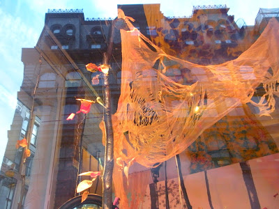
ABC Carpet & Home window display. This is like a spooky enchanted garden. I absolutely LOVE this. Birch branches, the tattered canopy, the leaves, and eery lighting are perfect materials for a chic halloween party.


My sister wants to have a wall of fabric. This type of application could be easy- just cut, cut, cut, cut, and affix to the wall. It think it would look great hanging on the wall and slightly (in the corners of the room) hanging on the ceiling, so you get the spider web effect.


I really, really, really, want to do something on the ceiling (but don't know if I'll win this battle) and thought this idea of ripped scraps of fabric tied to wire would be really fab!


Glitter skull found at Pottery Barn. It is $20 (a bit steep for a foam skull with glitter.) I am hoping to find a skull somewhere for super cheap and will then glitter it up for massive GLAM factor!


This ribbon treatment was on the eave/ awning of a little store in NoLita. I have seen this done often. It would look great in a door way long to the floor.


In the window of a hair salon in SOHO- Black roses in hanging bud vases with black water. I saw this all the way across the street and was instantly struck by how gorgeous and innovative this is- super easy to achieve.

Black Feathers, Ravens, Branches, fabric, rhinestones, roses............ so many materials that could work in this design.

Stay tuned for more on the Halloween design.

Cheers!

The Designista


Inspirations Everywhere: Saks Fifth Aveue

The Chivari Chair- You have seen these at many weddings, corporate events, etc. And if there is one thing I love, it is finding a random chair and making it into something bold and unexpected. I saw these in the Houseware Department of Saks Fifth Aveue. Saks is known for their visual department. This is a great little DIY idea. I thought they were so clever. Now, I am not saying this application of faux grass will work for everyone, but the concept of a bright color (on a chair that is otherwise gold or silver) with a funky seat cushion is a nice move.


Cheers!
The Designista

Monday, October 12, 2009

Pics from My Mom's Visit to NY and Little Bro's Visit to Princeton(one of the many reasons from my absence)


Jeannie and I joke this could be a MARNI advertisement. We are both wearing those fabulous shoes to Buddakan (the restaurant in Sex and the City The Movie where Big and Carrie had their rehearsal dinner.)

As mentioned in the previous post, I have had a lot going on the past few weeks. Two wonderful things that happened was my mom coming into town for a week, and visiting my brother at Princeton for a water polo game. I haven't seen my mother or brother in over 8 months. It was so wonderful! All we did was eat and shop, a lot of cocktailing, and every night ending in a slumber party. Here are a few of the highlights!


Me, Mom, and Jeannie- our "Buddakan Best"


A trip to NY isn't whole without a trip to Saks Fifth Avenue!!!

Afternoon brunch at BOBO- love this terrace. I will post about BOBO decor tomorrow.


Tasting fabulous cornbread at Bar Americain- Bobby Flay's acclaimed midtown restaurant

Posing at Rockefeller Center

Taryn, my mom, Wynter, Amy D, Isil, and Jeannie

Dinner at Malatesta Trattoria in the West Village- Love this little place, amazing food, all young italian men own and run the place, but don't love how the owner who is disrupting our picture- how rude.... He was probably drunk :)


Last night together, posing in the foyer of the Waldorf Astoria. It was an intersting time to be staying at the Waldorf. The G20 summit had just taken place and the entire hotel was swarming with secret service all week.

Oh geez, typical Amy- being a poser in a very dignified setting. Oh well, that's me. Take it or leave it! :)


Visiting my little brother aka "Brother" (that's an Arrested Development reference) at Princeton University. He is a second year at the US Naval Academy. He plays water polo and it was fun to see him play. Go Navy!


NAVY won!!! Beat Coast Guard - their big rival. I love seeing family!!!

All in all it has been a wonderful summer, and though the month of September was insanely busy, it was all worth it.

See you tomorrow with some fun design related posts.

Cheers!

The Designista


Back with Heart and Soul

(Nordstrom Ad I ripped out years ago)
I thought I would start off by saying how much I appreciate all of you who have contacted me, asking me "where I was." It's nice to know how much people appreciate reading my dailing rantings. I have been a bit overwhelmed at work and in life, and frankly, was getting a little stale on my postings. Nothing was creatively flowing from my brain any more. The Designista felt lost, with no theme and no heart, and I needed to take a little break to find its soul again.


I thought it appropriate to start this "welcome back" post, and yes, I am welcoming myself back, with the above advertisement. I was moved the moment I saw it- Nordstrom did its job! Not only does it appeal to my fashion sense, but to my inner most thoughts. I have had this on my refridgerator for possibly more than three years. It reminds me how we must go out and find our place in this world and in life- we can't sit back and wait for it to happen.


I know, this all may seem like a dramatic explanation for why I have been MIA, but it was important for me to share. And com'on, let's face it, I have never been one to shy away from talking..... my life is pretty much an open book.


So, that being said, I am going to apply the saying, "What if you didn't wait for opportunity to knock," to my blog, THE DESIGNISTA. And truthfully, to all aspects of my life. I have always dreamt of having this blog among many other aspirations, and love having the voice to discuss design, my social life, and my expedites through this new place- NYC.


There will be many things to look forward to, as I am trying to fine tune my purpose and theme of The Designista. But here are a few new things that will be added to the mix. Some I already do, but will do more, and others are suggested posts and ideas, as well as things to bring more traffic and excitement to the site.

  • More postings - Not all long - essays as my sister calls them :)
  • Do-it-yourself ideas- Focused mostly on DIY projects I do
  • Shop Stops (visiting more stores)
  • Ask The Designista- Quick Fix answers to reader's design related questions
  • Inspirations Everywhere- (taking more pics of things I see on the street and around NYC)
  • Ettiquette and Entertaining
  • Trends
  • Wish List- One item I absolutely love
  • A little more of, as my friend put it, "New-Girl-makin-it-in-the-Big-City," type of if posts. I really enjoy writing those.
  • Revamped Design (actually, more like- I need to bring a design to The Designista)
  • Twitter- Something every blogger does, and think sounds fun. I mean, the other day I literally ran into Drew Barrymore on the street, that could be an interesting little twitter update, not to mention all the countless design ideas I see throughout the day
  • Facebook Page- Also, essential to the online world.

I would really like suggestions from all of you telling me what you would like to see on THE DESIGNISTA. What makes you keep coming back? What do you want to see less of?

Thanks for being loyal and supportive, and so look forward to building this blog to something really special.

Cheers,

The Designista